[ART]GO!
Lead UX Designer (End-to-End) / Researcher
Researcher, timeline: September 2025 - June 2026,
Tools used - Figma, Paper, Pen, Google Sheets, Docs and Slides
Responsive Web Design Case Study
-
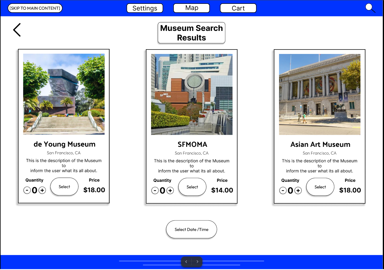
After completing the mobile app design, I applied the same visual language and core features to a responsive website to ensure a consistent experience across devices. The goal was to maintain usability and brand cohesion while adapting the layout for larger screens.
-
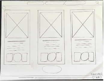
1. Desktop‑friendly grid – I adapted the mobile layout to a 12‑column grid for desktop, allowing for more breathing room and better use of screen real estate.
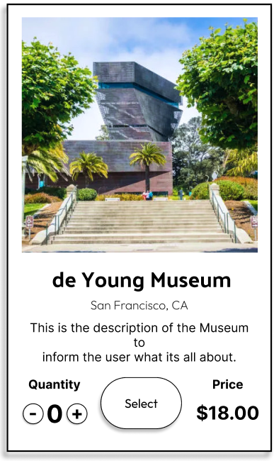
2. Carousel for museum discovery – I added a carousel to match web browsing behavior, making it easy for users to scroll through museum options without leaving the page.
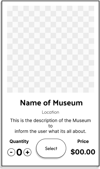
3. Consistent design system – I reused the same sticker sheet and components from the mobile app to maintain brand consistency and speed up the design process.
-
-
This project reinforced the value of a "Mobile First" mindset. Starting with mobile allowed me to focus on core functionality before scaling to desktop. Adapting the layout and interactions for a larger screen taught me how to maintain usability and visual consistency across devices while respecting the unique behaviors of each platform.