How I Built This Portfolio
“From Paper to Pixels”
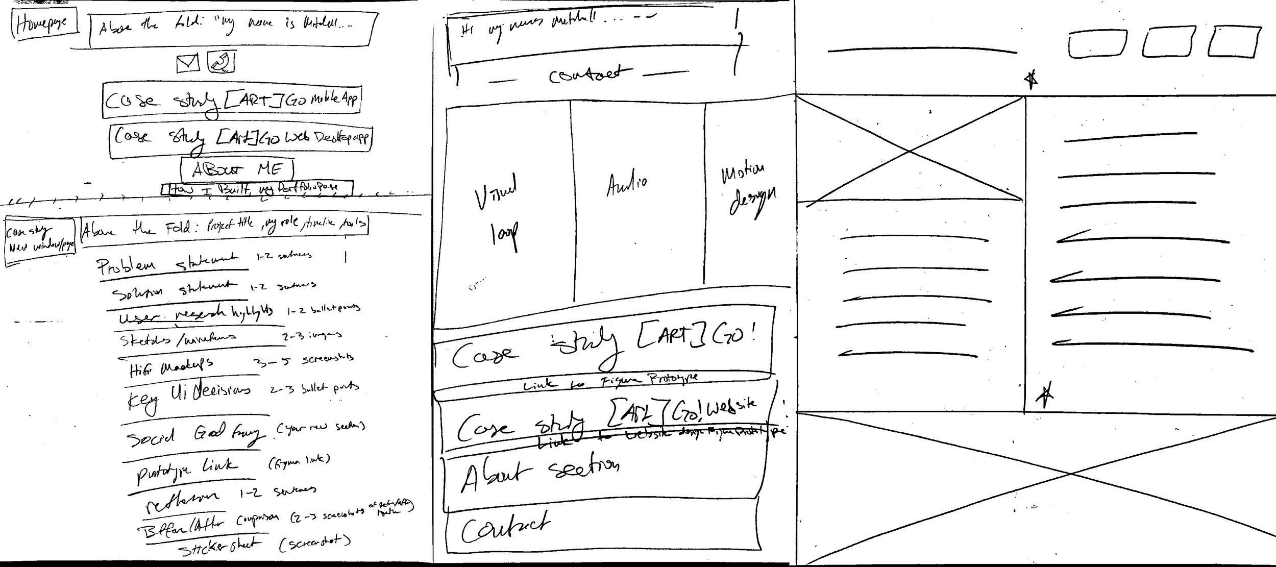
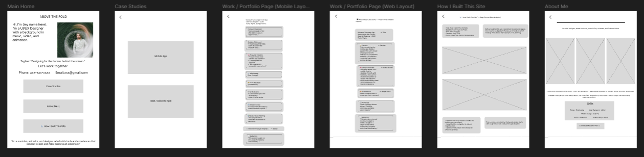
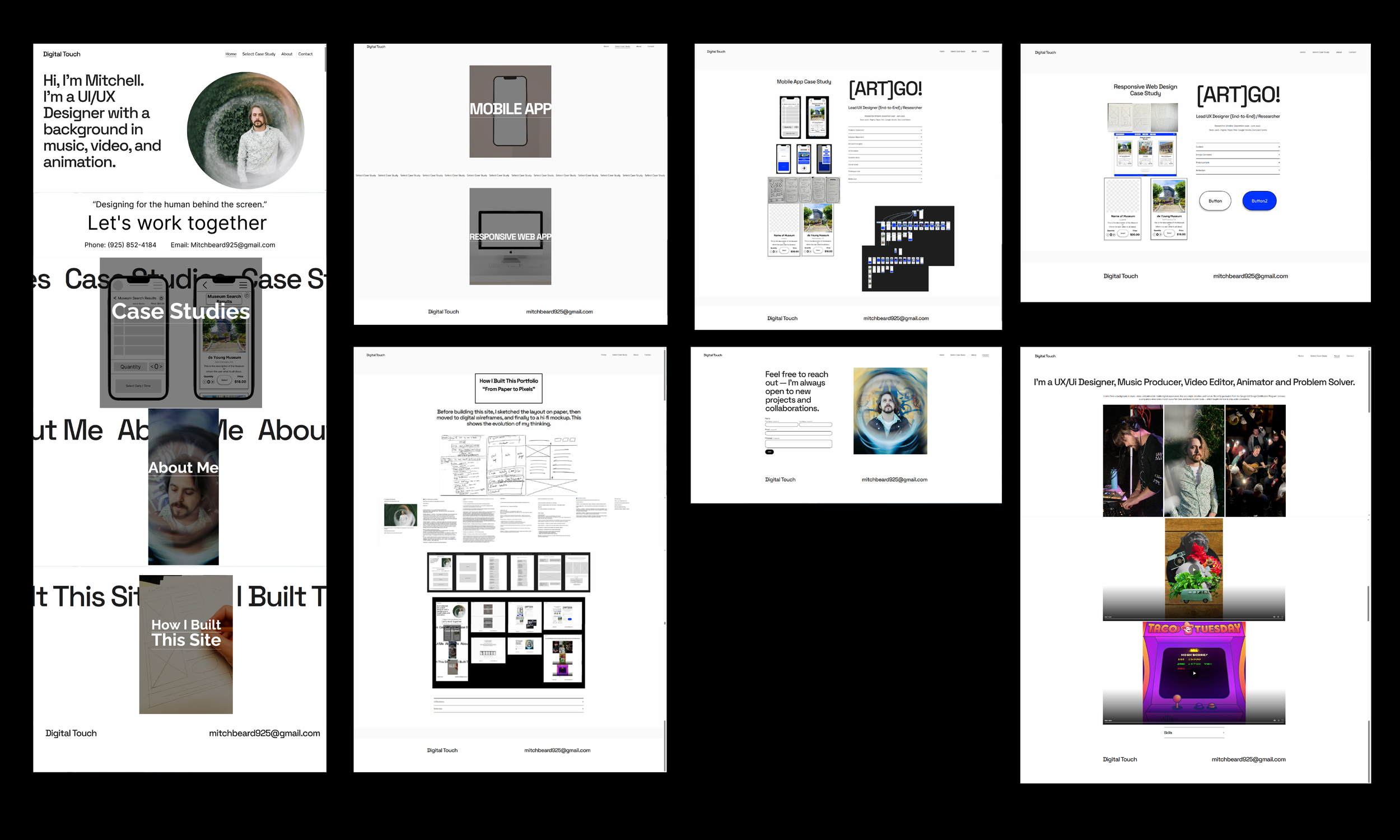
Before building this site, I sketched the layout on paper, then moved to digital wireframes, and finally to a hi‑fi mockup. This shows the evolution of my thinking — and reminds me that good design starts with rough ideas.
Paper Wireframe - initial sketches exploring layout and content flow.
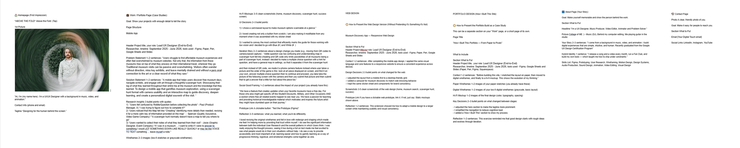
Content Layout - structured information and page hierarchy in document format.
Digital Wireframe - grayscale Figma wireframes with grids and placeholders.
Hi-FI Mockup - final design with color, typography, and imagery
-
1. Grouped case studies – I organized the case studies into a dedicated section for easier navigation, helping users find work quickly.
2. Image‑first layout – I prioritized visual storytelling by pairing each step of the process with a clear image and description.
3. Progressive disclosure – I broke down the content into distinct sections, allowing users to see the evolution from rough sketches to polished design without feeling overwhelmed.
-
This exercise reminded me that good design starts with rough ideas and evolves through iteration. Organizing the content into clear sections helped me focus on the most important points and made the page easier to navigate. I learned that simplifying the structure doesn't mean simplifying the thinking — it just makes it more accessible.